Thermograph Description
A thermograph is a chart that shows the daily recorded temperatures as well as the daily normal values and the extreme maximum and minimum temperatures for a specified time period. This cli-MATE product allows the user to either visualize this data graphically for a single year, season, or month for the selected station or to see the actual values in text (table) form.
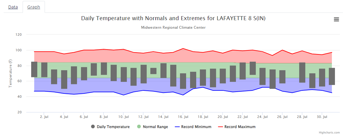
In the thermograph above, the black bars represent the maximum and minimum temperature range that occurred on each July 2014 day. The upper limit of the green area of the graph shows the 1991-2020 daily maximum temperature normal while the lower limit is the 1991-2020 daily minimum temperature normal. The red line displays the highest maximum temperature recorded on each day, and the blue line is the lowest minimum temperature ever recorded in the station’s period of record.
The tabular data option shows all of the data represented in the graph, but also adds the lowest maximum temperature and the highest minimum temperature ever recorded for each day at that station. The years the extremes occurred are also available in the tabular format.